Let’s face it, when it comes to building a website, one of the first things you need to nail down is the design. But it’s not just about making it look pretty. A truly great website needs to be responsive. What does that mean? Your site should look amazing on any device, whether it’s a smartphone, tablet, or desktop. With mobile internet usage skyrocketing, choosing the best responsive WordPress themes has never been more important.
Responsive WordPress themes automatically adjust your site’s layout and content to suit any device’s screen size. This not only improves user experience but also boosts your SEO rankings. It’s a win-win! So, whether you’re a blogger, business owner, or creative, we’ve got you covered with this guide on selecting the best responsive WordPress themes.
In this article, we’ll take you through everything from why responsive themes are crucial to a list of the top options on the market. Ready to dive in?
Why Responsive Design Matters
What does “Responsive” even mean?
First things first, let’s clarify what “responsive” means in web design. In simple terms, a responsive WordPress theme adapts to the screen size of the device it’s being viewed on. Whether you’re on a small phone or a big desktop, the theme reshapes its layout and elements to ensure the best possible user experience.
If your website isn’t responsive, users may have to zoom in or scroll horizontally to see your content. That’s a major turn-off. With Google ranking mobile-friendly sites higher, this is a crucial factor for SEO, too.
The Best Responsive WordPress Themes for 2024
Okay, now that we know how important responsiveness is, let’s dive into the good stuff. Here are some of the best responsive WordPress themes that’ll make your website shine!
1. Astra – Lightweight and Customizable
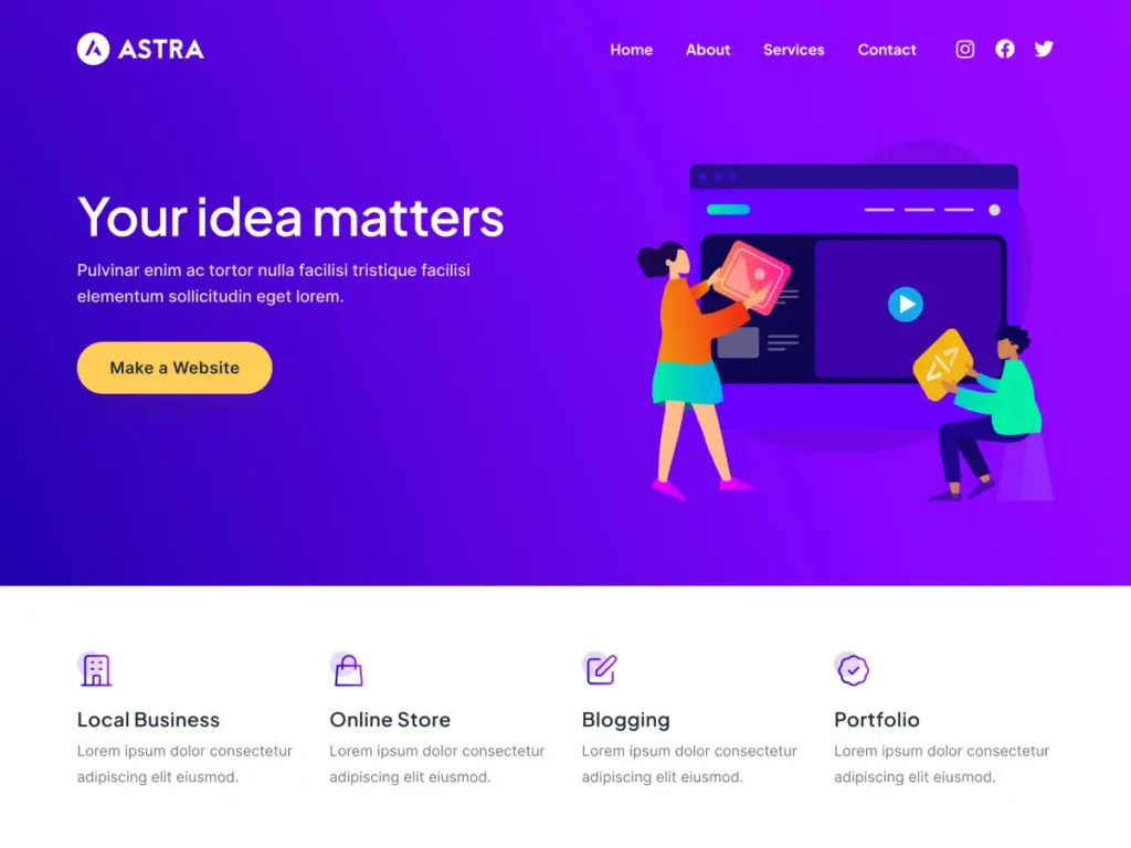
Astra is one of the most popular WordPress themes and for a good reason! It’s lightweight, fast, and incredibly customizable, making it an excellent choice for businesses, portfolios, blogs, or eCommerce sites. Plus, Astra integrates seamlessly with page builders like Elementor and Beaver Builder, so you can create stunning layouts with ease.
Features:
- Pre-built website templates
- SEO-friendly and fast-loading
- WooCommerce compatible
- Fully responsive design
2. OceanWP – Versatile and Full of Features
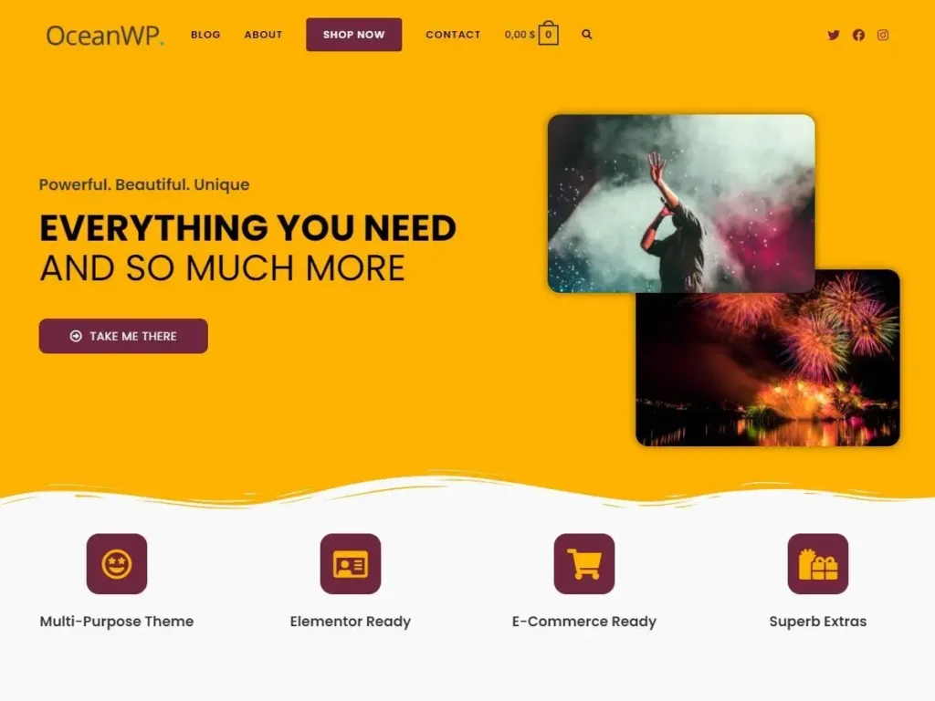
OceanWP is another top contender. It’s perfect for users who want flexibility and tons of customization options. Whether you’re creating a blog or a full-fledged online store, OceanWP has something for everyone.
Features:
- Custom header options
- Built-in demo content for quick setup
- WooCommerce ready
- Fully responsive across all devices
3. GeneratePress – Simple, Yet Powerful
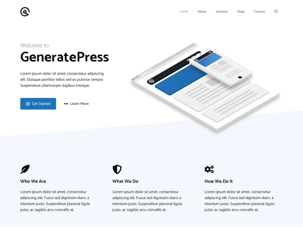
GeneratePress is all about simplicity. It’s perfect for those who want a clean, minimalist design without compromising functionality. Its focus on performance makes it a great option for SEO-driven websites. With its built-in responsive features, you won’t need any third-party plugins.
Features:
- Ultra-fast performance
- Responsive across all devices
- Highly customizable with the premium version
- Great for blogs, portfolios, and business websites
4. Divi – Designer’s Dream Theme
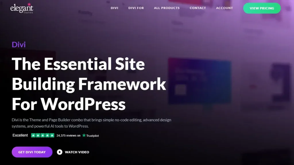
Divi by Elegant Themes is a powerhouse for those who want total control over their website design. It comes with a drag-and-drop builder and loads of pre-designed templates. Its built-in responsiveness means you don’t have to worry about your site looking off on mobile screens.
Features:
- Drag-and-drop builder
- Thousands of design options
- Mobile-responsive and customizable
- Perfect for designers and creatives
5. Neve – Speed Meets Simplicity
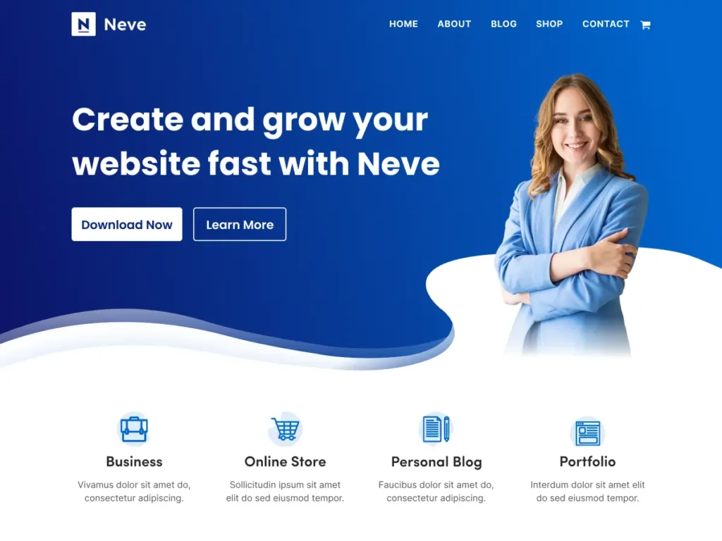
Neve is a fast, lightweight theme that’s fully responsive and perfect for small businesses or personal websites. It integrates easily with major page builders, and it’s optimized for mobile, so your site will look great on all devices without any extra work.
Features:
- AMP compatible for faster loading
- Customizable header and footer
- Full WooCommerce compatibility
- Responsive on all devices
6. Hestia – One-Page Wonder
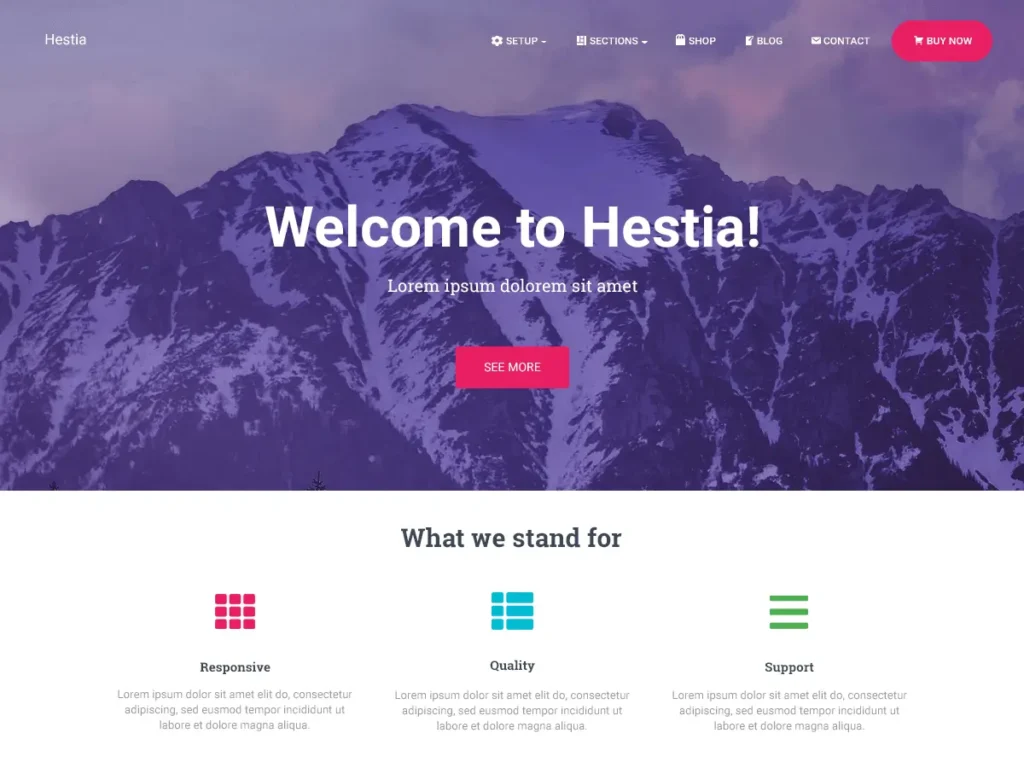
For those who prefer a one-page website, Hestia is an excellent choice. This modern theme offers a sleek, professional design with all the responsive features you need. It’s also optimized for performance and integrates well with popular page builders.
Features:
- One-page layout design
- Full responsiveness across devices
- WooCommerce ready
- Customizable with drag-and-drop builders
How to Choose the Best Responsive WordPress Theme for Your Site
Now that we’ve listed some of the best responsive WordPress themes, let’s talk about how you can choose the right one for your needs. Here are some things to keep in mind.
1. Speed and Performance – A responsive theme won’t do much good if it makes your site slow. Choose a theme that’s optimized for performance. A faster website improves user experience and contributes to higher SEO rankings.
2. Customizability – Different websites have different needs. Whether you’re running an online store, portfolio, or personal blog, your theme should give you the ability to customize without touching code. Look for themes with drag-and-drop builders and flexible design options.
3. SEO Features – Some themes come with built-in SEO features, such as optimized code and schema markup, to help your site rank better on Google. If SEO is important to you (and it should be!), make sure the theme you choose has solid SEO capabilities.
4. Mobile Compatibility – A truly responsive theme doesn’t just adjust in size; it ensures all elements, including text, images, and buttons, scale correctly for mobile users. Always check how the theme looks on mobile before making your decision.
5. Support and Updates – Look for themes that are regularly updated and come with excellent support. You want to ensure your site is secure, and having access to help when you need it is always a plus.
FAQs About Responsive WordPress Themes
1. What is a responsive WordPress theme?
A responsive WordPress theme automatically adjusts the layout and content of your site based on the screen size of the device it’s viewed on, ensuring an optimal viewing experience.
2. Why do I need a responsive theme?
With more users browsing the web on mobile devices, having a responsive theme is crucial for ensuring your website is accessible and user-friendly on all screens. Plus, Google favors mobile-friendly sites, which can help with your SEO.
3. Are all WordPress themes responsive?
No, not all WordPress themes are responsive. While most modern themes are built to be responsive, it’s always a good idea to check before you buy or install a theme.
4. Can I make my existing WordPress theme responsive?
It’s possible, but it can be tricky. If you’re using an old theme that’s not responsive, you may need to add custom code or switch to a new theme. Using a child theme for customizations is recommended to avoid losing your changes during theme updates.
5. How can I test if my WordPress theme is responsive?
You can test responsiveness by resizing your browser window or using online tools like Google’s Mobile-Friendly Test to see how your site performs on different screen sizes.
Conclusion: Make the Right Choice for Your Website
Choosing the best responsive WordPress theme for your website is essential in today’s digital world. It’s not just about making your site look good on mobile, it’s about ensuring that your users have a smooth, enjoyable experience no matter what device they’re using. Whether you’re a business, blogger, or creative, a responsive theme will improve your site’s accessibility, boost SEO, and ultimately drive more traffic.
So, what are you waiting for? Leap, and give your site the responsive design it deserves. Your users, and Google, will thank you!